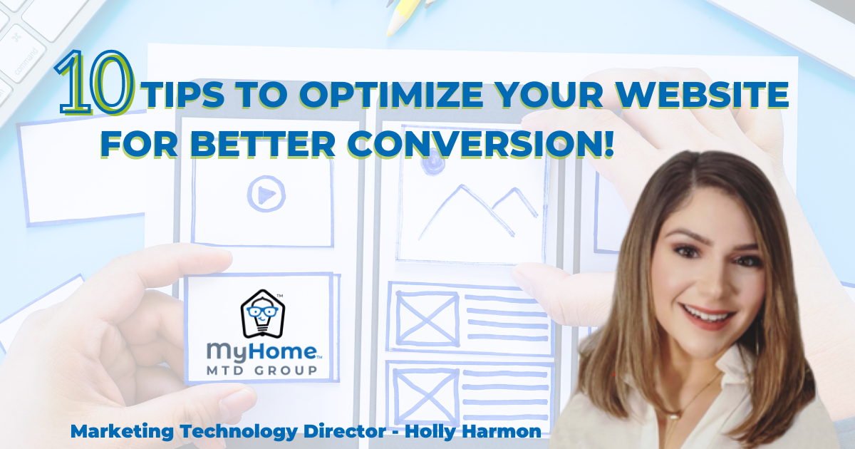
Convert To Close: 10 TIPS TO OPTIMIZE YOUR WEBSITE FOR BETTER CONVERSION!
February 27, 2023Convert To Close
When consulting on Title agent’s websites, I speak on consistent branding, overall design sophistication, and equally, if not most important, the strategic direction a user will follow from your website’s formatting. We review whether that effectively leads the user to complete the desired call-to-action.
Below are the 10 TIPS TO OPTIMIZE YOUR WEBSITE FOR BETTER CONVERSION!
- Hero Banner: At the top of your site, a photo of you, your team, or whoever should be represented for your company should be included in this banner. As a service-based business, it should also have a brief description or statement with your first call-to-action button there, such as a “quick quote” opportunity. This banner should be your brand’s brightest colors!
- Navigation: Make sure there is a header for every section you have and keep your top navigation customer-focused! Leave the legal information, copyright, etc., for the footer.
- About Page: When telling your story, ensure you are benefit-focused throughout it and remember that this is written as if it is a conversation between you and the prospect; you can get rid of the third-person point of view.
- Value Prop: Know YOUR unique selling proposition. This proposition should clearly state why users and prospective clients should use you over the title office down the street. This proposition would be in addition to or learned from your experience gained in Title over the years.
- Testimonial: Add the absolute best review you’ve received with a photo of that client and their name to provide social proof.
- Links & Buttons: All buttons should be the same color to allow user efficiency in navigating what is clickable. Also, be sure to look for any broken links that could put a roadblock in your conversion process.
- Sight Lines: Include an image with eyesight lines to draw attention to important text! For example, this could be an image of you facing left or right to where once placed next to the embedded contact form it looks like the image of you is looking in that direction and subliminally directing users to that contact form.
- Social Media: Unless you are strategically using your web traffic to grow your social media accounts, and have a conversion strategy there as well, leave all social links to the footer, so your clients are sure to select that “quick quote” opportunity or fill out that contact form without being distracted.
- Process Length: Be mindful of how many steps it takes for a prospective client to complete the desired actions. For example, they saw your social media post, went to the link in your bio, clicked the link to your website from that landing page, then had to scroll through two sections of your website to get to the information mentioned in your post. Think about ways you could potentially reduce those steps.
- Customer Experience: Once a contact form has been submitted, add a “Thank you” landing page; this will allow you to add a video setting expectations or get the ball rolling with a link to your Calendly to set up the call with you.
To get help implementing some of these tips and meet with a Marketing Technology Director for your website consultation, connect with your WFG Sales Rep or your current MTD today!

